The Eight Types of Logos
You probably already know a logo is an image or mark that symbolizes your business. Did you know there are EIGHT types of logos? Below, I’ll explain each type as well as their pros and cons.
Each type of logo is either an image, typography, or combination of both. They will all give a brand a different and specific feel. Because your logo should leave an impressionable mark on your customers and what they will visually identify you with, aside from your product(s), you want to make sure you knock it out of the park on the first pitch. If you want to choose the best logo for your business, here are the eight types of logos you need to know about.
Wordmarks or Logogypes
Wordmark logos are text font-based logos with some minor or no tweaking. If your business is primarily focused on your brand name, go with a wordmark logo.
Pros:
- Easy to decipher and read
- Instant recognition
- Known by brand name
Cons:
- Not legible at small sizes
- Not a good solution if the business name is too long
Lettermark or Monograms
Logo marks that are designed by combining 2–3 letters are known as Lettermarks or Monograms. Widely used by companies who have large names.
Pros:
- Strong recognition
- Works well for brands with large names
- Known by brand name
Cons:
- Not legible at small sizes
Pictoral or Symbol
Symbolic logo marks use an icon as the main symbol to represent the brand. The brand is synonymous with the icon. Many well established brands use pictoral or symbol marks.
Pros:
- Easy to scale large or small
- No text required for recognition
- Good for making a brand future-proof
Cons:
- Choosing a single symbol to represent your brand can be difficult
- Requires brand name if not a well-established and recognizable brand
Abstract
Abstract logo marks are a pictoral/ symbolic image but not an image of an object. Mostly based on abstract, geometric shapes that represent your brand.
Pros:
- Future Proof
- Eye-catching and unique
Cons:
- May not immediately visually summarize your brand to newcomers
Mascot
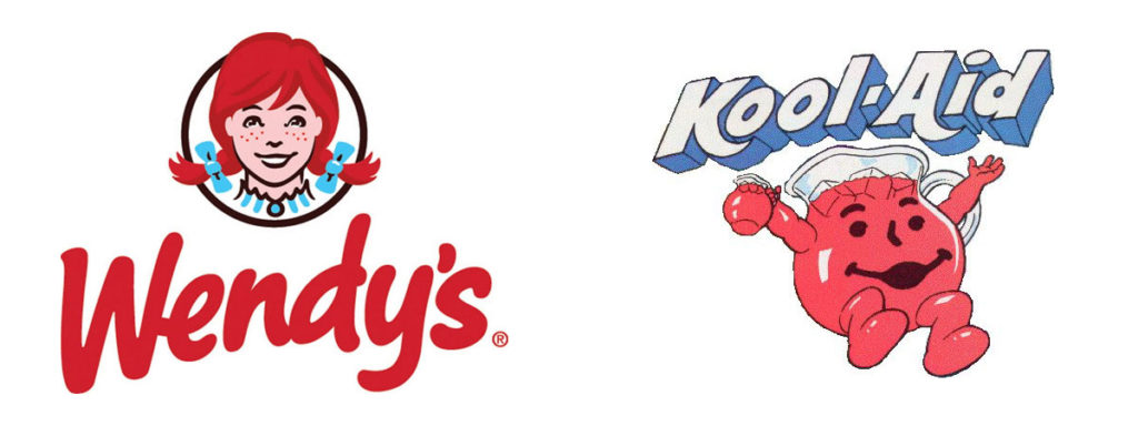
Mascot logos are mostly illustrated logo marks that include a brand relatable character.
Widely used for sports or fast-food brands and are full of color and attention-grabbing.
Pros:
- Eye-catchy
- Easily Connectable
Cons:
- Hard to scale down in size
- Increases print cost
Combination Mark
Combination marks are graphics with both text and a symbol or icon that conveys the brand image that you wish to create for your company or organization. Concise text can complement an icon or symbol, providing supplemental clarity as to what your enterprise is all about. Mostly, combination marks include logotype with symbol or icon.
Pros:
- Future Proof
- Eye-catching and unique
- Recognizable
Cons:
- Sometimes used as a crutch to support poorly designed logotypes or icons
Dynamic
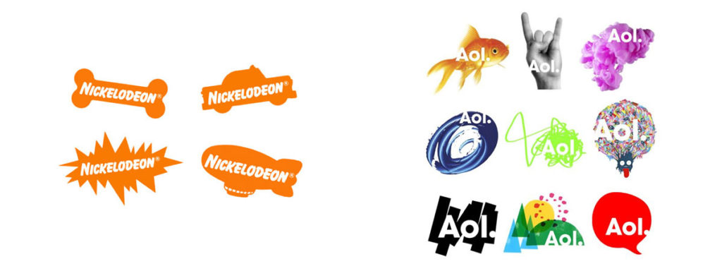
Dynamic logos are also known as an adaptable logos — a logo that changes depending on the context in which it’s placed. Unlike the above-mentioned logotype, dynamic logos are meant to be transformed. It can be any type of change from color to the symbol.
Pros:
- Adds to your brand identity and uniqueness
Cons:
- Not always immediately recognizable
- Requires strong context
Emblem
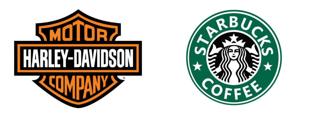
Emblem logos are the oldest form of logos still in popular use. These are logos that are present with text and a symbol inside a solid shape. These logos have a traditional feel to them. Emblems make a good first impression and are easily recognizable. Emblems are mostly are chosen by government offices, the automobile industry, schools, colleges, and universities.
Pros:
- Bold and make a striking impact
Cons:
- Less versatile
- Complicated
- Increased print costs

Recent Comments